This Website, Liquid, and Sass
Hey! I’m new to this whole blogging thing, so bear with me. I’m not entirely sure what I want to post up yet, but I think I’ll use this to revisit my game engine and some other things I’m working on, kinda like a public journal. I’m hoping that anyone that’s trying to find information on the same things I’m working on can find this page too.
This site’s mainly gonna be in base markdown, and I’ll edit the css for stuff as I see fit. The big exception here is my projects page, which I spent about a day making it nice and responsive for mobile. I think it worked well! Flex boxes are so nice for super responsive designs. Actually, I’ll get into it here.
So, I’m not that familiar with web design principles other than keeping things as small as possible, but I’m very familiar with designing systems in a way that lets me be as lazy as possible. Thankfully, Jekyll, the static site generator that this blog is based on, allows me to do just that.
The first thing I set up was an image that has automatic credit if you include it. I don’t want to type this out every time I need it:
<!-- credit-image.html -->
<div class="credit-image">
    <img src="{{ include.src }}" alt="{{ include.alt }}" />
    {%- if include.credit -%}
    <div class="showcase-image-credit">
        <p>{{ include.credit }}</p>
    </div>
    {%- endif -%}
</div>
It’s nice, pretty clean, and the include statement’s pretty simple:
{%- include credit-image.html src="/img.jpg" alt="image!" credit="Me" -%}
The end result looks something like this:

Me
This also automatically styles the image and everything in a way that makes sense, so it’s pretty easy to just drop it in every time I want to use it.
I’m not a huge fan of how Liquid does everything from what I’ve used of it, but allowing for easy pluggable HTML elements is a massive time saver and I quite like it. Some of my gripes come from how the docs don’t quite match up with Jekyll’s version of Liquid, though.
There’s a little more behind that page, notably the layout of all the text / image boxes. It took me a while to figure everything out, but I knew it had to be possible since I’ve seen these nice reponsive designs everywhere. That’s how I found my new favourite layout: Flex.
Now, I know I’m late to this party. I took a web design class in highschool (2017/18, I think), and I went hard with writing out my own CSS. I wasn’t quite good enough to figure out how to start making my own reusable libraries though, and I just had one massive CSS file that I would pass around. It worked alright, but my files were an absolute mess. That class was pretty notable for not being HTML/CSS based in the slightest, and most people would use Adobe Fireworks. I couldn’t stand using it, so I just didn’t. My websites were significantly cooler. Back to flex.
This website’s got, in my opinion, a pretty alright usage for when I want it. The HTML looks something like this:
<div class="col-info-table-container">
    <div class="col-info-table flex-second">
        <p>Content! Amazing!</p>
    </div>
    <div class="col-info-table flex-first">
        {%- include credit-image.html src="/img.jpg" alt="stuff" -%}
    </div>
</div>
and the CSS, using Sass:
.col-info-table-container {
    display: flex;
    flex-direction: row;
    gap: 2rem;
}

@include media-query($on-palm) {
    .col-info-table-container {
        flex-direction: column;
        gap: 1rem;
    }

    .flex-first {
        order: 1;
    }

    .flex-second {
        order: 2;
    }
}
So, .flex-first and .flex-second are intentionally omitted from the desktop CSS so I can control the order by positioning them. You can see that when you visit the page on desktop. On mobile, however, having flex-direction: column wasn’t really good enough, as half the images would end up below the text and the other half above. I liked the images above the text a lot more, so order under a display: flex was exactly what I needed. It looks great! The example below uses this code, so swapping between mobile and desktop will show you what it looks like.
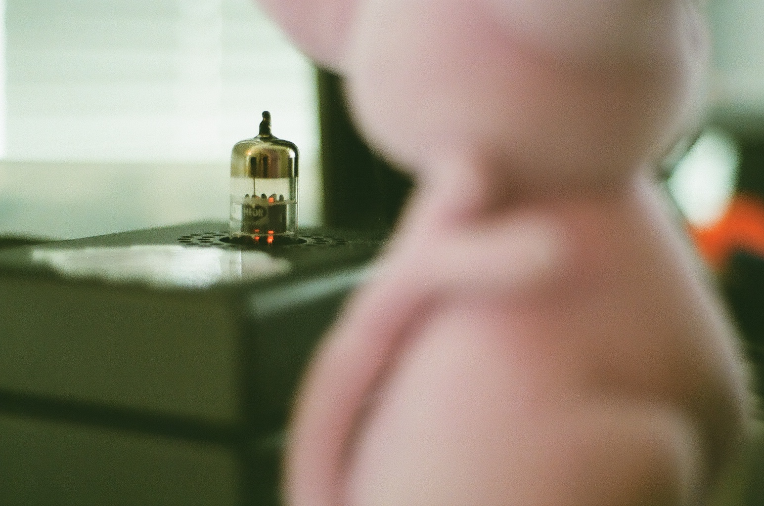
That's a Vali 2 on top of a Modi, from Schiit. It sounds pretty good for how small it is!
I still have one issue with it, mainly in that I can’t really separate it out to its own Liquid include. I technically could, but the amount of parameters I need gets a little bit atrocious. Liquid doesn’t let you nest include statements, which I find annoying. I could just pass all the include parameters for the credit image into the other file, I just kinda hate it. Also, I’d need to maintain two versions of the file so I can have an image on the left and an image on the right if I did that. That’s not quite clean enough for how I want to use it, so just dropping the base HTML into my markdown files is good enough for now.